SACCAT wrote:I heard for a friend in the UM athletic department ( see I talk to some griz fans.) That they are going "all black" for one of the games. He said the will have black plants, tops, helmets, and the numbers will be black with silver lining.
So black and silver and no maroon??
Sounds like it could be cool, but I'd hope they have at least some maroon in it. Kind of like how Oregon uses the dark green as an accent in their all blacks.
SACCAT wrote:I heard for a friend in the UM athletic department ( see I talk to some griz fans.) That they are going "all black" for one of the games. He said the will have black plants, tops, helmets, and the numbers will be black with silver lining.
Hooray. Mick Delaney's replacement is gonna be Jerry Glanville.
SouthDakotaGrizzly wrote:This might be the new Montana St. logo. Got the image from http://www.uni-watch.com. Supposedly it was leaked by an MSU track athlete.
Dont really like the ear, but the rest of it aint bad
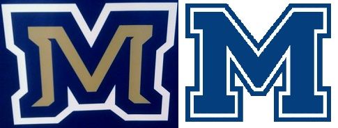
Webers logo is a huge improvement and I love it for weber. However Montana states current bobcat logo and the "m" on the helmet with the front to back strips is the best in conference. The most iconic cfb logos are sometimes one letter that says it all. Michigan, Alabama, tennesse, Washington, Oregon, Minnesota, Arizona. The bobcats beat Montana to it IMO. Keep it classic and don't fix what works.
EWU FOOTBALL 2004|2005|2010|2012|2013|2014|2016|2018|BigSky Champions EASTERN WASHINGTON|2010 NATIONAL CHAMPIONS
BlackFalkin wrote:Webers logo is a huge improvement and I love it for weber. However Montana states current bobcat logo and the "m" on the helmet with the front to back strips is the best in conference. The most iconic cfb logos are sometimes one letter that says it all. Michigan, Alabama, tennesse, Washington, Oregon, Minnesota, Arizona. The bobcats beat Montana to it IMO. Keep it classic and don't fix what works.
Appalachian State Mountaineers:
National Champions: 2005, 2006, and 2007 Southern Conference Champions: 1986, 1987, 1991, 1995, 1999, 2005, 2006, 2007, 2008, 2009, 2010, and 2012
NO DOUBT ABOUT IT! WE'RE GONNA SHOUT IT! NOTHING'S HOTTER THAN A-S-U!
BlackFalkin wrote:Webers logo is a huge improvement and I love it for weber. However Montana states current bobcat logo and the "m" on the helmet with the front to back strips is the best in conference. The most iconic cfb logos are sometimes one letter that says it all. Michigan, Alabama, tennesse, Washington, Oregon, Minnesota, Arizona. The bobcats beat Montana to it IMO. Keep it classic and don't fix what works.
uofmman1122 wrote:The more I see it, the more I like it.
They did a great job of not making it cartoony, unlike Weber State.
I agree. The more I look at it the more I like it. Looks more like an actual Bobcat. I don't know how I'd feel about not having the M on the helmets but as far as the head itself is concerned I think they did a pretty good job (if that is truly what it's going to look like).
BJuice wrote:We (Charleston Southern) have a new head football coach. That may (or may not) mean a different provider. It has been New Balance in recent years. I hope that a new coach means a new provider. I know sometimes the coach is tied to the provider and other times the school is tied to the provider. Not sure what the case is in this instance.
I love our colors and wouldn't change them at all. Navy and Vegas Gold.
However, I would REALLY like to see a better, more professional, and more marketable logo.
CSU has great colors and I 100% agree with you on the logo. I give CSU a lot of grief but truly, I wish to see you all do very well.