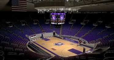
UCABEAR wrote:More progress. The white boxes are Southland logos. Bear paws on the corner also. Black walls are different and I'm going to need to get used to them.
Photo courtesy of a fan on ucafans.
I hate to be like the "end zone seating" snobs for football stadiums but...
You need baseline seating BAD. The new floor looks great, but I've played in nicer high school gyms
We do need closer seating all around. However, there is a set of wooden bleachers that extends out on the left hand side of the court (in the picture they are pushed back) that provides seating for the pep band. We need more butts in the seats in general, and then we will see about nicer digs. The place isn't ideal, but the facelift helps.
UNI is getting a new floor this year. We bought the floor we played on in the S16. I can't wait to see if we put a new design on...I sure as hell hope we do.
UNI is getting a new floor this year. We bought the floor we played on in the S16. I can't wait to see if we put a new design on...I sure as hell hope we do.
Post some pics when you get a chance! A new floor gives the fanbase a great new perspective of your school! Plus I'm a big hoops fan and love to visit other arenas and the ones I can't it 's neat to see them in photos. (especially new ones!)
The new court isn't coming in until Aug 8th, or later, from what I understand. I would think we are getting it already finished though.
The Valley logos were Red, White, and Blue (the conference colors but it looked dumb having those colors on our court). The logo was much smaller, and the court just looked bad I thought
WSU's new jumbotron looks eerily similar to the old one; however I am sure the new technology will make it look a lot better. Whenever I watched a WSU home game on Big Sky TV, they would show WSU's jumbotron with the score for the duration of halftime and it always looked like something straight from a Sega Genesis game.
The Valley logos were Red, White, and Blue (the conference colors but it looked dumb having those colors on our court). The logo was much smaller, and the court just looked bad I thought
That's real nice bro, I like that.
If you don't like what I say you can PM me and get handled.
I agree. UNI has a nice court. I love the windows on the upper deck that lets all the light in. Sweet. Plus the floor level seating. Just a wide open clean look that students should be proud to attend games in. Wish UCA would lose the walls and the gothic black look and open Farris Center up to some sunlight.


(especially new ones!)